Showing posts with label Storefronts. Show all posts

Tuesday, December 19, 2017

LISC #CorridorChallenge Storefront Improvement Design Guidelines

Last month, we wrote about the importance of using PR and Communications to build buzz around important commercial corridor work – with the Commercial Corridor Challenge as a prime example. LOA has been working closely with the New York office of the Local Initiatives Support Corporation (LISC) on the Commercial Corridor Challenge, a program funded by Citi Community Development that provides financial and technical support to some of New York City’s most underserved and rapidly changing communities.

As part of our work, we helped put together a set of guidelines that not only informs Corridor Challenge participants about relevant New York City code and regulation requirements related to storefront improvements but also suggests best practices for these improvements. With architectural expertise from Dadras Architects, the guidelines also features renderings of potential storefronts on Bay Street in Staten Island, Southern Boulevard in the Bronx, and Fulton Street in Brooklyn.

The guidelines covers a range of storefront improvements including signage, lighting, awnings, façade and paint and color. It offers visuals of best practices in each section so that users of the guidelines are able to easily understand and implement the improvements.  


Here are some highlights of the guidelines:
  • Avoid the use of security gates to increase store transparency. If necessary, open-mesh security gates on the interior can still provide visual access for security (preferred by law enforcement) and will not be subject to alteration by graffiti.
  • Maximize the visibility of your signs without compromising transparency of storefronts. This might include illuminating signs with separate light fixtures and ensuring signage does not block doors or windows.
  • Avoid waterfall-style awnings. Retractable canvas awnings are highly recommended because they get less dirty and last longer than fixed awnings.
  • Use interior and exterior lighting to illuminate your storefront and street. Adequate lighting is a proven crime deterrent.
  • Fix broken windows and avoid paper signage. Broken or boarded windows negatively impact the overall commercial corridor and paper signage obscures the business activity from potential customers on the street.
  • Use color and painting to enhance storefront appearance. Remember to coordinate colors to fit the context of the neighborhood.
By increasing the transparency, lighting, and physical attractiveness of businesses, the Commercial Corridor Challenge program hopes to provide long-lasting benefits to participating corridors by boosting foot traffic and improving sense of safety in these areas. For more useful tips around storefront improvements, download the guidelines here!

We hope this resource will also prove helpful in rethinking and redesigning your storefront.

Tuesday, August 22, 2017

The Do's and Don'ts of Outdoor Displays

A furniture store in Sanford, FL
curates a seating patio outside its store.
Nur Asri is an associate at Larisa Ortiz Associates

The public realm is extremely important in commercial districts. While plazas and parks offer areas for visitors to rest and enjoy a meal, sidewalks make up a larger percentage of the public realm and are often optimized by businesses to attract customers. As a result, many store owners have taken to displaying merchandise on sidewalks as ‘teasers’ to what else is in store for potential customers.

However, business owners need to be aware that every city has its own regulations around sidewalk merchandise displays. Here in NYC, although stores are permitted to have outdoor displays of merchandise with no required licenses (for the most part.. Note: ‘Zero Sidewalk Display’ streets and streets in historically designated areas), these displays are restricted by types of goods and by size and structure.

The City requires that items displayed outdoors consist only of goods that are available for sale inside the store and that all sales must still occur inside the premise. Structures used to display the merchandise outside the store must also be temporary in nature and may extend no more than 3 feet into the sidewalk from the building line, and no higher than 5 feet. If a business owner were to break any of these regulations, a fine between $250 and $300 may be issued by the City.

In Cambridge, MA, where we recently completed work on a citywide retail strategy, the outdoor display of merchandise is even harder to do because a sidewalk obstruction permit is required by the City of Cambridge and costs $75 to submit.

Regardless of municipality, businesses must recognize that the regulations around sidewalk merchandise display are often well-intentioned and aim to meet the following three key principles:
  1. Maintaining standards of cleanliness and hygiene
  2. Enhancing pedestrian comfort and safety
  3. Ensuring collective business viability

More than 8' width pedestrian zone outside
this fresh food market in Mt Vernon, NY.
Through our work in different downtowns and commercial corridors across the state and country, we’ve seen a number of best practices in outdoor merchandise display but we have also seen some that have done more harm than good to the overall business environment. Here are some quick tips to ensure you use outdoor merchandise displays to your business’ and your corridor’s benefit.

Do’s:

Leave sufficient sidewalk space for pedestrians to walk. On busy downtown commercial streets, for example, the City of Boston recommends a minimum of 8’-12’ width dedicated as the ‘pedestrian zone’ to ensure easy flow of pedestrian traffic on sidewalks. The clear path will ensure the sidewalk remains accessible to multiple users, including those in wheelchairs or pushing strollers, and will also maximize the foot traffic for businesses.
(NYC sure was right in limiting the depth of outdoor display structures to no more than 3 feet from the building line!)
Shoes on display outside this men's clothing store
maintains a clear path to the doorway.

Keep the path to the store’s entrance clear from any physical barriers. The fewer the barriers to entry, the more likely the customer will walk beyond the entryway. Having seen a teaser of products outdoors, businesses will want customers to continue browsing merchandise indoors and extend their dwell times so ensure that outdoor merchandise displays do not block the entryway nor reduce the visibility of the store’s entrance.

Maintain a neat, organized and relevant display rack. The success of your business and the success of your overall commercial district are interrelated. If your district’s sidewalks were spilled over with messy and unmaintained outdoor merchandise displays with expired or irrelevant products, the overall image of the district would be spoiled and customers would perceived a neglected commercial street and take their shopping elsewhere.

Switch out and rotate the merchandise you put on display outside every other day (in the case of fresh flowers, fruits and vegetables) or every few months (in the case of seasonal gifts and clothing) and ensure the display racks are kept tidy. Maintain a good image for the corridor and your business will only reap the benefits.

Curate and get creative with your outdoor merchandise display. A well-curated outdoor display can attract both visitor and resident customers. Take the time to select and curate pieces that market your business best. Furniture and antique stores, flower shops, and even bike shops are increasingly using outdoor merchandise displays to their advantages and luring customers with unique and colorful outdoor product displays.

Don’ts:

Florist on Montague Street, Brooklyn NY
Clutter products in the allowable outdoor display areas. If displays appear cluttered and messy, customers are more likely to be confused by the products offered by the store and will quickly move on to neighboring businesses. After all, “less is more” is the common rule for merchandising. According to retail experts, high product density results in visual chaos that overwhelms the shopper. There isn’t enough time for the shopper to sort through the clutter and determine if the merchandise is of enough interest to stop and shop. 


Stack products high in front of store windows. Often, business owners get overexcited about being able to promote merchandise outside and forget the importance of maintaining transparency of storefronts. Sure customers are now able to see products on display outdoors, however, storefront transparency also serve to discourage crime with ‘more eyes on the street’ and reduce energy consumption by letting natural light into the store. Remember that many storefront guidelines recommend having 70% of the façade surface completely transparent between 2’ and 10’ height above the sidewalk.

Display products that are hard to reach by customers. When businesses pack as many products as possible outside, it becomes physically impossible for a consumer to shop comfortably”. As a result of stacks and stacks of products, shoppers are often unable to reach most of the products on display and are therefore unable to examine the merchandise more closely, resulting in them losing interest and walking away.

While outdoor merchandise display can do wonders in advertising and promoting goods on offer in stores, it is important to note that some products lend themselves better to outdoor display than others. For example, lighter-weight articles can easily be blown over by wind outdoors, and food and drinks may become spoiled from long exposure to sunlight and humidity. We’ve also seen long articles of clothing getting dirtied by outdoor dust and particles, ruining the overall appearance of the sidewalk display.


If you’re thinking of enhancing the vibrancy of the sidewalks in your commercial district, first make sure you abide by the regulations set by your municipality and, secondly, ensure that the displays don’t result in dirt or mess on the sidewalks, and don’t create tripping hazards, fire hazards or nuisances for your customers. After all, your customers’ experience is central to the success of this effort.


Wednesday, September 7, 2016

Enhancing Business Visibility: Six Tips for Producing Effective Retail Signage

It is well know that visibility is a key factor to retail success. Quality signage can be an easy and effective tool to make sure passersby see (and perhaps enter) business establishments. An effective signage not only shows customers where businesses are, but it also communicates their brand and identity and can be a powerful tool shaping overall corridor and district perception.

While it’s clear that signage is an essential tool to operating a successful retail establishment, there are many factors that must be considered when developing an appropriate signage strategy. Below are six tips to have these in mind when working with local businesses in facade improvement or district beautification efforts.

Example of clear and visible signage (note that despite being on the window, the signage did not obstruct views to inside the store)

Tip 1: Focus on Customer Experience

At the most basic level, retail signage has one purpose: to communicate with the customer. Businesses should prioritize this goal above all others when developing retail signage. After all, what’s the point of a sign if the public can’t understand the message around it? There are several ways to improve the customer experience.

Make sure businesses signage have appropriate size and placement. If signs are too big your district might end up overwhelming customers. If wrongly placed, signage might not be seen or might block another business signage, generating conflict and visual confusion for customers.


Analyze the district with fresh eyes. One of the best ways is to walk your district like a customer. Be honest about what works and what doesn’t. What’s easy to find, and what is missing? Are the signs easy to understand, or are they jumbled or confusing?

Tip 2: Think About Location, Location, Location

Sign placement can seem deceptively simple, but there are many important elements to consider. Of course a sign needs to be placed in an appropriate location where it can be seen, interpreted and ultimately drive consumer action. But what else do you need to consider? For exterior signage, make sure businesses place it where it can be seen by as many passersby—on foot and in vehicles--as possible. Consider factors like glare, and what might block it (parked cars? Delivery trucks? Hot dog cart?) at different times of the day or week. Effectively placed, businesses will have a guaranteed presence worth far more than the cost of the sign installation. As an expert marketer put it: “You pay for your signs once, and they work for you 24 hours a day, 7 days a week.” (Bang 2011)

This creative signage spruces up the store entrance and reinforces the business identity as an antique store


Tip 3: Check out the Competition

Do your homework and check out other stores signage, especially the ones you admire. They don’t have to be in your district.  Pay attention and consider whether it’s a good model for the businesses in your district. By benchmarking other businesses (and districts), you just may discover something that you should do—or even not do—in your own district.


Tip 4: Get the Look Right

Once the type and placement of signage is established, it’s time to make sure the messaging looks professional and well-designed. There are some basic graphic design rules that should always be followed. “Be consistent with the feature lines, price, size, color, and fonts so the customer’s eyes can easily scan the sign. Allow for plenty of white space, keep the font simple, be sure the text is balanced and proportional and consider using bullets. Highlight words in bold or by using a different color. Avoid using all capital letters, which makes it difficult to read.” (DS 2006)

Color choices are also critical. Even a sign that looks nice and professionally designed from an aesthetic perspective may not be as readable as it needs to be in a retail environment. Using contrasting colors in the font and background is highly recommended. The most visible colors are black, white and red for the text, and these should be printed over backgrounds that are as opposite as possible. For example, white text on a black background, or red type over a yellow background can improve readability. Backgrounds that are nearly the same color as text can render signs nearly unreadable.

Tip 5: Be Clear and Keep it Simple

Clear, compelling messaging is what sets apart great signage from mediocre. Different signage has specific goals, and when a retailer can convey these distinct messages in a way that is clear, informative, and above all, still on brand, that business is going to be more competitive. Informative signage such as directional signage must be concise and readable to enable users to understand the message with a split-second glance.

Good quality signage doesn't require expensive materials. With simple paint is possible to have attractive and efficient signs.

Tip 6: Make Quality a Priority

Given that all business owners know how critical it is to inspire trust in their customers, it’s surprising how many stumble at producing well-made, error-free signage. And it doesn’t have to be this way. Creating quality signage is an easy and inexpensive way to cultivate that trust. “Signs will convey your authority and attention to detail. Make sure they are clear and accurate every time. Poorly printed signs, misspelled words and other inaccuracies can erode your credibility.” (Kinsella 2012)


Simplicity is key.  To be effective, signage must be easy to read. As some experts warn us: "Some signs are so full of tiny images, starbursts, exclamation marks, and small print, that you can’t take it all in.” (Inspire 2013).


Blade signs are a very effective way to capture pedestrians’ attention. The signs above are simple, straight to point and very effective in communicating what these businesses are about.


Works Cited/Referenced:
Business 2 Community. 5 Ways for Retailers to Drive Sales Using Digital Signage. 2012. Source Link
DS Marketing Solutions. Retail Signage…Tips for Increasing Sales & Service. 2006. Source Link
Foxfire. How to Start Using Retail Signage. Source Link
Inspire Retail Solutions. How to Create Effective Retail Signs. 2013. Source Link
John Kinsella. IGC Retailer. Powerful Signage Promotes Your Brand. 2012. Source Link
Kevin Johnston. Demand Media. Rules for Effective Retail Signage. Source Link
Bang Advertising. Why Exterior Signage Provides the Best ROI for Retailers. 2011. Source Link

http://www.signsbytomorrow.com/custom-retail-signage


Tuesday, March 8, 2016

Five Design Principles that Every Facade Improvement Program Should Incorporate

By Patricia Voltolini, Associate, LOA

What is the first thing you notice when you visit a commercial district? Storefronts and buildings probably make that list. Great storefronts are critical to a vibrant street environment. They engage passersby and contribute to active street life. Not surprisingly, façade improvement programs have become a common and effective tool in many commercial district revitalization efforts.

Yet many facade programs go wrong quite quickly. Without design guidance, the "after" might not look much better than the "before", and resources spent will have less impact than you might like. Unfortunately, overcoming this issue can be a challenge. Many BIDS, BIAs or CDCs working to revitalize low-income or distressed corridors do not have the budget to engage a retail designer to help prepare and review façade improvement applications. Even when they do, this person is often not a retail design expert.

With that in mind, we thought it would be helpful to share some of our own insights as they relate to the key takeaways from a wonderful new publication entitled, Laying the Groundwork:Design Guidelines for Retail and Other Ground-Floor Uses in Mixed-UseAffordable Housing Developments, prepared by the Design Trust for Public Space in partnership with the NYC Department of Housing Preservation and Development. The publication is the result of extensive research and collaboration from a broad range of design and retail experts - including our own Principal, Larisa Ortiz - who served on the advisory panel. It is available for purchase on the Design Trust website.

While the report outlines best practices and provides practical guidance for those building new retail space in mixed-use buildings, we think it also provides excellent insight for those looking to develop facade improvement programs. A good facade improvement program not only impacts the overall look and feel of the district, but if done with certain principles in mind, can help businesses achieve higher sales. Incorporating these concepts into your facade program design will help ensure that the program meets the objectives of your district stakeholders as well as the businesses themselves.

So keep in mind the following key principles as you design your facade improvement program....

1. Maintain Transparency

There is growing recognition of the importance and value of transparency in driving retail sales. A transparent storefront invites customers inside with products and services on display. It also discourages crime by providing what urban theorist Jane Jacobs called “eyes on the street”. Making the facade as transparent as possible allows for a full visual exchange between indoors and outdoors. Customers and shopkeepers inside the store see what is happening on the street and pedestrians outside see the activity and offerings in the store. This interdependent relationship benefits both customers and retailers. 
The same storefront with different window treatments create a very different corridor environment. The previous merchant (also a pharmacy) completely covered the windows and failed to create any visual connection to the interior of the store. The new pharmacy made the windows completely transparent, and uses them to showcase products while allowing enough visual exchange between indoors and outdoors.


In order to maximize transparency, the design guidelines recommend having 70% of the façade surface completely transparent between 2’ and 10’above sidewalk-level, with measures in place for attractive privacy solutions when needed.

In many urban districts, retailers (even after a façade improvement program) cover their windows with sales posters and signs. Store-owners want to attract customers with these signs but in doing so they block visual connection between inside and outside and often create an uninviting storefront. A customer who can't see inside a business is highly unlikely to walk inside.

One way to keep the façade transparent and place signs  at the lower (or upper) section of the storefront, immediate below (or above) eye-level.


The same facade before and after renovations. The image above (before) shows all windows entirely covered with signs, a typical feature of many supermarkets and delis in urban districts. The image below shows the same supermarket after a facade renovation. Despite significantly covering the windows with sales posters, the owner  made an effort to keep some level-of transparency by placing signs below and above pedestrian eye-level.

This dollar store has large windows (over 70% of its facade is glass) but the store owner has covered it almost completely with products, blocking any visual connection to the interior of the store.

Another common occurrence is having non-retail stores (salons, professional offices, etc.) with minimal transparency. These businesses should also be regarded with the same design standards as other retail businesses as they are also key components of the streetscape and as responsible for creating vibrancy in the corridor as retail stores are. In fact, the design guidelines presented in Laying the Groundwork  target not only retailers but also banks, laundromats, and even community uses like cultural space, healthcare and childcare facilities.

This facade provides an excellent example of what non-retail stores should look like (or not). The space on the left has a highly transparent and engaging storefront while still providing some level of privacy to its users. The space on the right, however, has windows but they're completely covered with shades and gates and impede any visual connection between inside and out.
In order to guarantee full transparency, facade improvement programs should add a clause requiring windows to be kept free (or with minimal) signage and that product display should not block vision to the store's interior. In fact, the  minimum of 70% transparency recommendation does not refer only to the substantial presence of store windows, but that these windows be kept fully transparent.

Exterior illumination provides light on the sidewalk and highlights the facade at night. Exterior lighting can also be used to accent trees and planting. An active, well-illuminated street frontage improves safety for retailers, residents, and the district. It also reduces the need for security gates by creating a safer street front.

One important consideration is the relationship between lighting and store signage. Both should be coordinated and the new façade design should minimize lighting presence above the sign, especially if the units above are residential.

2. Maintain  Connections between the Storefront and the Street by Minimizing Barriers
An active, well-illuminated street frontage improves safety for retailers, residents, and the district. It also reduces the need for security gates by creating a safer street front. Ideally, security gates should not be allowed in retail spaces under lease agreements. There are many other ways to provide security, including security systems with video, sensors, alarms, etc.

Unfortunately, in many urban communities, transparency is often trumped by safety concerns. For example, many retailers elect to put up solid security gates as a anti-theft measure. However these gates only serve to accentuate concerns about safety. Your facade program should discourage, or require, less obtrusive forms of security. If roll down gates are required, share alternatives to exterior rolls down gates. (See our previous post "Are there viable alternatives to roll down gates?")

Air conditioning units can also be barriers and jeopardize a facade design's  potential to creating vibrant streets. Avoid whenever possible the installation of air-conditioning units over doorways or having them protrude through the façade. Instead, plan the placement of louvers to enhance the facade and the quality of the retail storefront. Provide a clear zone for louvers on the exterior storefront. Finish louvers to match the color of the surrounding storefront elements so that they are an integral part of the facade design.

A store's visibility has significant impact on retail sales - this is why businesses pay more for corner locations ("end caps" in retail parlance) where the store is visible to customers from a variety of angles. Effective signage can also play a role in improving visibility. In pedestrian environments, signage that projects from the building (i.e. blade signs) offer pedestrians strong visual cues that there are businesses in the vicinity. In one community where we worked, the installation of blade signs increased pedestrian traffic down a previously quiet street by 30%. (See our post "Pittsburgh Neighborhood Unveils Strategies Aimed at Drawing Tourists")

3. Keep the Street Wall Continuous and Avoid Gaps

The conditions of street-level retail are intimately connected to the quality of the customers’ experience in your district. The benefits of well-designed storefronts extend far beyond district attractiveness. From fostering community pride to serving as catalyst for further economic investment, they create positive changes to the social, economic and environmental health of the commercial district and surrounding communities. Although this recommendation is not technically about facade improvements, it does suggest that by clustering facade improvements and/or creating a continuous street-wall of improved storefronts, the program can have greater impact. Consider using the the facade program in a targeted way along a single block front for a limited amount of time. Or design the program as an incentive to fill vacancies - perhaps by increasing the allowable grant contributions when used for a vacant space. 

4. Maintain Flexibility for a Variety of Potential Tenants

Effective retail spaces are flexible. In many districts, the needs of tenants vary widely. Offering flexibility means greater potential to fit the needs of a larger set of prospective tenants. One suggestion is to design the façade program so that it has the potential to accommodate multiple entries. Another is to require improvements that result in on-grade pedestrian entries to ensure ease of access. Consider a retailer whose customers are young families with children - a set of steps will cause immediate concern. How might a parent with a stroller make it up the steps? Or a senior citizen - or anyone with mobility challenges? 

5. Remain Distinctive so that Shoppers Can Easily Find the Retailer

Retail entrances that are clearly marked and distinct from other street-level uses (residential or office entrances) facilitate wayfinding and help catch a shoppers eye. While the guide suggests a minimum of 15 feet between any retail entrance and other uses, we think that clear visual delineations are more important than actual physical distance. Awning and other design elements, like signs, can be deployed in a way that ensures a retailer has a clearly defined entrance.  

Thursday, November 5, 2015

Six basic principles for building thriving commercial districts in low-income communities

Our most recent projects have taken us to Bridgeport and Trenton, two former industrial powerhouses, both now struggling with the impact of industrial displacement, poverty and population decline. Yet there remain residents in these communities for whom improvements are critical to life outcomes. And in our opinion, we really don’t have much time to waste. As Nathaniel Hendren, Harvard Economist and founder of The Equality of Opportunity Project was quoted in a recent New York Times piece, “where you grow up matters.” So simply put - and so true. His research has shown that for “every extra year a child spends in a better environment – as measured by the outcomes of children already living in that area” improvements to childhood outcomes can be demonstrated.

In our work we have found that addressing the corridor challenges of the lowest income communities means thinking more creatively about how to address anemic market conditions. So for practitioners working in these challenging and complicated environments, we share a few principles that we have come to deploy in our work....

1. Support the creation of community retail nodes – rather than dispersed retail. Businesses thrive in clusters, and the convenience of being able to patronize a few businesses at once will enhance the appeal of the district as a whole - benefiting all businesses by driving more traffic than each might on their own. 


This existing node of retail may not look like much,
but it serves the local community and is located at a well trafficked intersection. A district like this is in a better position to benefit from improvements than an area that is less visible and off the beaten path. 

2. Visibility, accessibility and convenience. Retail needs a good location to work. You can’t fabricate these fundamental market conditions if they don’t exist, so don’t try to create a district somewhere where the fundamentals aren’t in place. In some places, whether we like it or not, this means a place that can be easily accessed by car (with adequate parking). In other places, this means access to public transit, or an easy, direct walk by foot or bike. If you ignore this principle you are just setting yourself up for failure. So make sure you are working on retail concentrated in places that are accessible and receive plenty of visibility. Think busy intersections rather than sleepy side streets (even if those side streets once contained vibrant retail in days of yore). 

And sometimes minor, seemingly inconsequential barriers to access will hurt sales. Making your customers walk any further than they have to can result in them hopping right into their cars to find a parking spot somewhere where they won't have to walk. Sad but true. 

Great parking on one side. A great jazz club restaurant on the other. In between? A canal.
So all those folks leaving work in the evening are ten times less likely to do anything but jump in their car and go elsewhere. 


3. Consider businesses that do not depend as heavily on discretionary income, because if you don’t have enough residents with discretionary income right now, it might be awhile before you have enough to support new businesses. So instead think about uses that can be sustained through public funding or other income streams, such as publicly funded day care centers, urgent care clinics, non-profit service providers, educational or workforce training programs, etc. These kinds of businesses not only fill space, but they also generate traffic can result in the added benefit of creating enough demand to support a small amount of auxiliary businesses, from food related businesses – a pizza shop or deli – to a pharmacy or convenience store.

Increasingly urgent care facilities are taking over ground floor retail space.
These facilities can provide an extra level of medical service in communities that desperately need them. 
4. Build density – sometimes there is no way around it. In some communities, population figures are so anemic that the only adequate response is to build housing. This is where Community Development Corporations have excelled over the past few decades, using important financing tools like the Low Income Housing Tax Credit or Section 202. While these resources are unfortunately increasingly limited, they have proved critical in turning neighobrhoods around and in creating the market demand over time that can support small businesses.  

A vacant lot of Southern Boulevard in the South Bronx

The same vacant lot after local CDC WHEDCO developed the project into quality affordable housing.
5. Focus on the physical environment – focus on improvements to the physical environment that will address issues of safety. Think about graffiti clean up, street clean ups, vacant lot clean ups – these kinds of activities can help build neighborhood pride and in fact do have an impact on neighborhoods. Research funded by LISC, one of the nation's largest community development intermediaries, found that the impact of Philadelphia's vacant lot program had a positive impact on the sales of local businesses, real estate values in the district and shopper preference. A win-win all around. 

New Kensington CDC in Philadelphia was one of the early adopters of the vacant lot maintenance program, now called Philadelphia LandCare. At some point these lots may be developed, removing the "missing teeth" from the district. But for now the maintained lots have made a significant improvement along the corridor. 

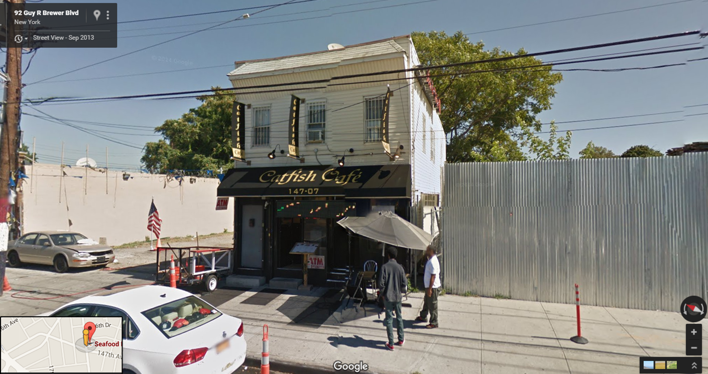
6. Focus on helping small businesses address public safety and visibility issues. Sometimes small investments in physical improvements, such as lighting or signage, can help existing businesses capture more market share. Moreover, these small investments can make a big difference in the perception of public safety. A transparent window, or well positioned lighting, can make a store that most didn't think twice about visiting more appealing. 

This seafood restaurant in a lower income community in Queens is doing lots of things right.
Transparent windows, outdoor seating, blade signs. 

The main take away is that a commercial district in a lower income community must find ways to ensure that every potential dollar that can be captured is in fact captured. There is little room for error. That means removing all possible hurdles that prevents customers from easily and conveniently patronizing local businesses. And in some cases, that means building the market to create more demand for retail - read new development. While that process can sometimes take a long time, with a strong road map and an understanding of the kind of market conditions necessary for business to thrive, I have seen time and again that neighborhoods can in fact change and improve, benefiting the residents that live there. 

Wednesday, June 26, 2013

Are There Viable Alternatives to Roll Down Gates?

A graffiti-covered roll down gate
Roll down gates. Love ‘em or hate ‘em, they are a reality in many urban communities. To the average consumer, the presence of roll down gates suggests crime, lack of security and overall urban blight. Yet to many business owners in communities with historically high levels of crime, the idea of openly displaying the merchandise in their store after hours is like an invitation to smash and grab. The roll down gate gives them security and peace of mind not only from theft, but also from vandalism in the form of graffiti or glass etching. 

Yet more and more communities are finding that the removal of roll down gates does not result in an increase in either theft or vandalism. In 2009, the New York City Council passed a law requiring see through gates that offer 75% visibility (the law only applies to new gate installation), determining that the benefits outweigh the risks. The idea is that transparent gates (or no gates at all) offer ambient light in the evening that helps keep a street safer, allows police to see inside a store in case of an emergency, and helps to make a neighborhood look and feel safer. Store owners also find that visibility can be helpful - customers are able to browse when the store is closed and perhaps find a reason to come back. In some communities the Commercial District Management Association has tied the distribution of storefront improvement dollars with the replacement of solid roll down gates, a nice carrot that encourages business owners to do what they otherwise might not. 

As Commercial District Managers grapple with convincing their business owners to give gateless windows a try, we sought to offer some alternatives that we have seen work...

Behind-the-Window Roll Down Gate. If roll down gates are required, these by far are my favorite option. They provide a nice balance between business and community concerns. One good example is The Elbow Room, a mac-and-cheese shop in downtown Newark, NJ. The see through roll down gate is located behind the window, allowing the renovation of a historic storefront to shine, even when the store is closed. 

Look Ma, No Gates at All! In some communities, the lack of roll down gates by newer businesses is a sign of confidence in overall community safety. 


Transparency at Eye Level. Not the best option...but an option. 


And then there is the option of "If you Can’t Beat em, Join ‘em."
Lauren Collins, Executive Director of the Church Avenue BID
at the press event for  "Uncover Church Avenue"
That is exactly what the Church Avenue Business Improvement District in Brooklyn, NY did. Executive Director (and Coro Neighborhood Leadership alum) Lauren Collins drew her inspiration to create a storefront mural program after she and I discussed the success of the Excelsior Storefront Mural Program in San Francisco (http://www.eagsf.org/excelsior-mural-program.html) - a program I was familiar with from my years running LISC's national commercial technical assistance program. Lauren took the idea and ran with it, engaging local artists in a competition that garnered over 50 submissions. Volunteers even helped paint the murals. The program, entitled “Uncover Church Avenue”, garnered local press and participating businesses were thrilled to receive makeovers. Here is a local news piece on the program. 


Friday, March 16, 2012

Roundup: Everyday Facades

Facade improvement programs are a great way to spruce up a district when funds are fairly limited. Below are three examples of facade improvements for "everyday" businesses that aren't typically filed under best practices when it comes to facades....an autobody shop, a corner bodega, and a dry cleaners. With a little TLC, anything is possible.

Facade #1: The Autobody Shop - Can you spot the autobody shop? It's the one with the art hanging in the window!
Auto body shops are not typically a use you welcome on a lively commercial district...but when you can't do much about it, this kind of facade treatment can make a difference.
A facade improvement supported by People's Emergency Center (PEC) in Philadelphia, PA

Facade #2: The Corner Convenience Store - Corner bodegas where I'm from are usually covered in posters with limited visual appeal. This bodega in Boston got facade support from the Boston Redevelopment Authority and now serves both new and old residents alike.

Don Quojote Market in Boston - a great example of how technical assistance and design support can help a long-time tenant weather changes in neighborhood demographics.

Facade #3: The Dry Cleaner - What I love about this facade improvement is the fact that they moved the tailor right in front of the window. Not only does the facade look nice, but this entertainment feature is visually interesting to pedestrians as well.
Bridge Cleaners in downtown Brooklyn, NY

Wednesday, February 22, 2012

Using Murals to Reinvent the Roll Down Gate


One of the winning murals. Love it!

About a year ago, Lauren Elvers Collins, Executive Director of the Church Avenue Business Improvement District, called me up to chat about ways to spruce up her district for a grant proposal. She mentioned how the look and feel of the district changed so abruptly the minute businesses rolled down their solid gates - not an uncommon challenge in many urban commercial districts. The discussion reminded me of a great program that I was familiar with from my work at LISC. The Excelcior Action Group (one of my all time favorite organizations!) has a wonderful Mural Program that works to beautify the district's numerous solid roll down gates while also reducing the incidence of graffiti. Lauren took the idea and ran with it, turning this simple concept into an exciting program that included significant community input, and a competition that spurred media input.

UCA Exhibition at the Brooklyn Public Library
 
Church Avenue BID's Uncover Church Avenue initiative is a great example of how BIDs are carrying out this type of program with maximum community input at every step of the process. Thanks to this initiative, Church Avenue in Brooklyn, NY will have five new colorful and vibrant additions to the neighborhood this spring.

Uncover Church Avenue is a public art competition that was designed to bring attention to the district. What it also does is beautify the street (particularly in the evening) with artwork by local artists, while also abating graffiti in the district. The contest engages artists, residents, children, and merchants to take an active role in deciding the look of their neighborhood. The five winning designs - selected from over 50 submissions from Brooklyn-based artists and students, will be installed on commercial gates along the Avenue. The goal is to encourage vibrant commercial activity along a stretch with the most abundant vacancies, and to highlight and promote the unique character of the neighborhood. Merchants see the potential in promoting their business, local artists have a new venue to display their work, and curious residents have a new reason to walk down the street.

Visit the program's blog to see the winning designs, learn step-by-step how the project developed, and to stay current on the murals' progress.

And if you're in the neighborhood - visit the Flatbush Branch of the Brooklyn Public Library through Feb. 24 to see images of mural sites and all submitted mural proposals.

Thursday, November 3, 2011

Round-Up: Long Island City, Queens, NY

Long Island City, a former waterfront industrial area on the East River, facing Manhattan, has seen an incredible amount of development recently. With those new residents have come a more diverse retail mix.

Some great examples of signage, seasonal decorations, and creative storefront facades. These are the hallmarks of a up and coming business district....


I also LOVE this facade treatment for a local bakery....look closely. Those are rolling pins!

Now here's the kicker. This appealing outdoor space is next to.....a GAS STATION. Amazing what some smart design can do to mitigate a not so pleasant circumstance.

Wednesday, October 5, 2011

Going "Store by Store" to Help Local Business Owners Improve their Displays

Finding ways to help local business owners improve their window displays is a perenial issue. The small convenience stores typically found in urban areas are notorious for their cluttered displays, boxes and merchandise in the window blocking views into the store (which has the added "benefit" of turning store into a target for thieves), and posters and stickers haphazardly placed over all the windows. Many of us are very familiar with this challenge. But a creative partnership between a local Visual Arts school and a local development corporation in Staten Island hopes to change all that. As a consultant to the Coro Neighborhood Leadership Program, the first commercial district leadership training program of it's kind in the nation, I had the benefit of hearing Michelle Sledge, Economic Development Coordinator for the Northfield Community Local Development Corporation share the impact of her "Community Change Project" with her NL colleagues as part of our final program day.

The results of her efforts, a program dubbed ¡Revive!, brings together graduate students from the Manhattan School of Visual Arts (SVA) to provide volunteer service that helped make the display windows of Monte Alban, a Mexican market, more appealing. According to Michele, the owner couldn't be more pleased with the outcome and believes it is helping business. Her story is one of many that I heard yesterday that continue to inspire me - and I hope they inspire you too! I'll be sure to share a few others with you in the coming weeks.

Here is a great video documenting the day....